Process
Calculating a New Field
Basemap
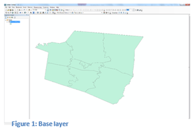
For this example, shown in figure 1, Shelby County Kentucky will be the base layer. A county census tract map is the displayed geography. Any county can be used in this analysis as long as at least five or more census tracts are contained in the county and the appropriate data on education and income are part of the shapefile. Click the Toolbox button to begin the process.
Toolbox
The Toolbox is a separate program that will only run in ArcMap Desktop or ArcCatalog.
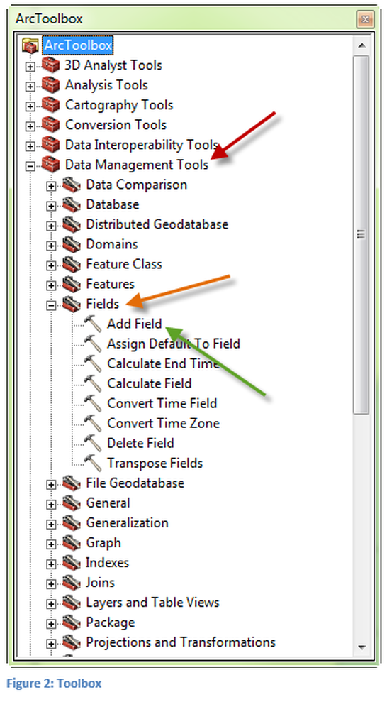
As seen in figure 2, select Data Management Tools pointed to by the red arrow. Then select the Fields Tray pointed to by the orange arrow. Finally select the Add Fields Tool pointed to by the green arrow.
There are other ways to add fields to an attribute table but this process is more straightforward.
Adding the Field
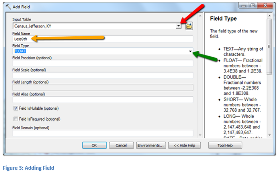
A new window will appear once Add Field is selected, as seen in Figure 3. The first step is to select the shapefile in which the field will be added. This is accomplished by using the pull down arrow if the shapefile is already on the map. If the shapefile is not loaded on the map use the file folder button to locate the shapefile. The red arrow points to the pull down for the loaded shapefile and the folder button icon is located to the right. Next a field name must be selected it must contain no more than eight characters and none of them can be a special character or a space. This goes in the second dialogue box. There are different types of fields that may be selected, which are shown in the window on the right side. Since a calculation is being done the field type must be one in which a numeric value may be stored. If the characteristics of the solution are known, then an appropriate field can be selected, when unsure how the resulting calculation will format use the Float type.
The remaining boxes may be left blank. The process will be executed when OK is pressed. Progress on completing the task will be visible in the lower right corner of the screen. When completed a pop-up window will appear for a few seconds with a green check mark showing that the operation was successful completed.
The remaining boxes may be left blank. The process will be executed when OK is pressed. Progress on completing the task will be visible in the lower right corner of the screen. When completed a pop-up window will appear for a few seconds with a green check mark showing that the operation was successful completed.
Calculate Field
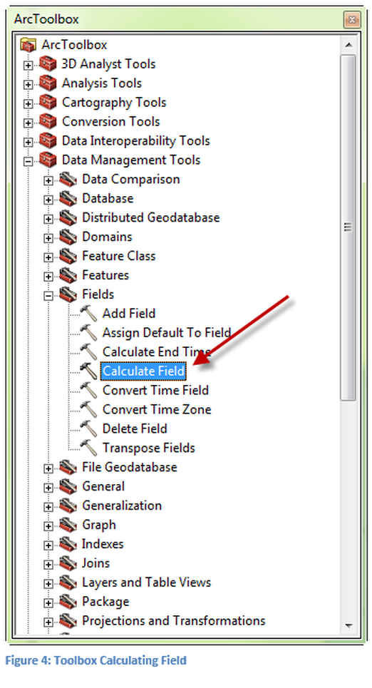
A new field with a Float type format has been created, no data was added to the field. Return to the Toolbox to complete the field calculation. This process can also be done without utilizing the Toolbox, but again the process is more straightforward by using the Calculate Field tool, as shown in Figure 4. Once the tool is selected a new window will open to request parameters for the data to be added in the new field. It is important to remember that the table is a database. Therefore, it is different from a spreadsheet, such as Microsoft Excel, in which calculations are modified when values change. In a database the calculation is completed one time and does not change if the value changes again. The formula will no longer be active once it is used.
Defining Calculations
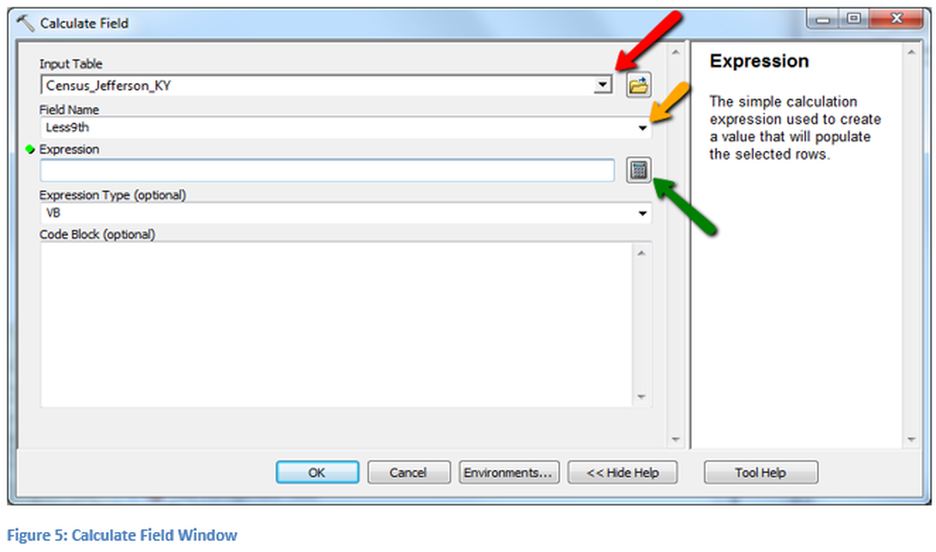
In this step the calculation statement is generated. Select the input table using the pull down assuming it is loaded in ArcMap Desktop. Next select the field in which the calculation will be placed, be careful to select a blank field, i.e. the one just created. If a populated field is selected the current contents would be overwritten with the new information from the calculation. The field selection has an orange arrow pointing to it, shown in Figure 5. Make sure that these steps are performed in this order as the table must always be selected before the field. Next click on the calculator button which will open the field calculator, the green arrow is pointing to this button.
Calculator
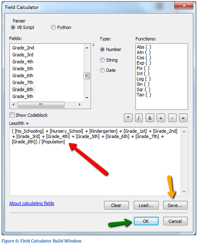
The data from the U.S. Census Bureau will need to be understood prior to calculating the new field. There are numerous fields in this data table. The Census Bureau website has a data dictionary to assist in the identifying of the different fields. To simplify this example the names were changed prior to providing the data. For this technical lesson the number of people who live in each Census Tract having less than a 9th grade education will be totaled.
Use the buttons and fields to create an expression that looks like the one that has been created in Figure 6: Field Calculator Build Window. It is suggest that the selected items including the mathematical operators not be typed directly. The parentheses around the summation of the fields was manually inputted into the expression. The divisor is the total population of the census tract. This will provide a ratio of the people with less than 9th grade level of education to the entire population of the Census Tract, the result will be less than one. Standard mathematical order of operation must be followed so that the expression is calculated correctly. The expression is not automatically saved, to manual save the expression click on the save button, pointed to by the orange arrow. The expression will be saved as a text file. Click OK to complete the defining of the new field.
Use the buttons and fields to create an expression that looks like the one that has been created in Figure 6: Field Calculator Build Window. It is suggest that the selected items including the mathematical operators not be typed directly. The parentheses around the summation of the fields was manually inputted into the expression. The divisor is the total population of the census tract. This will provide a ratio of the people with less than 9th grade level of education to the entire population of the Census Tract, the result will be less than one. Standard mathematical order of operation must be followed so that the expression is calculated correctly. The expression is not automatically saved, to manual save the expression click on the save button, pointed to by the orange arrow. The expression will be saved as a text file. Click OK to complete the defining of the new field.
Execute the Calculation
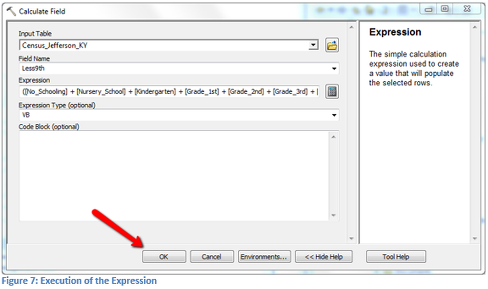
The calculation will be executed in background once Ok is selected and will appear as scrolling text in the lower right corner of the screen, as seen in Figure 7. When the process is completed a pop-up window will appear for a few seconds with a green check mark. Remember there are other ways to do this same process, such as using the attribute table.
Properties Window - Symbology
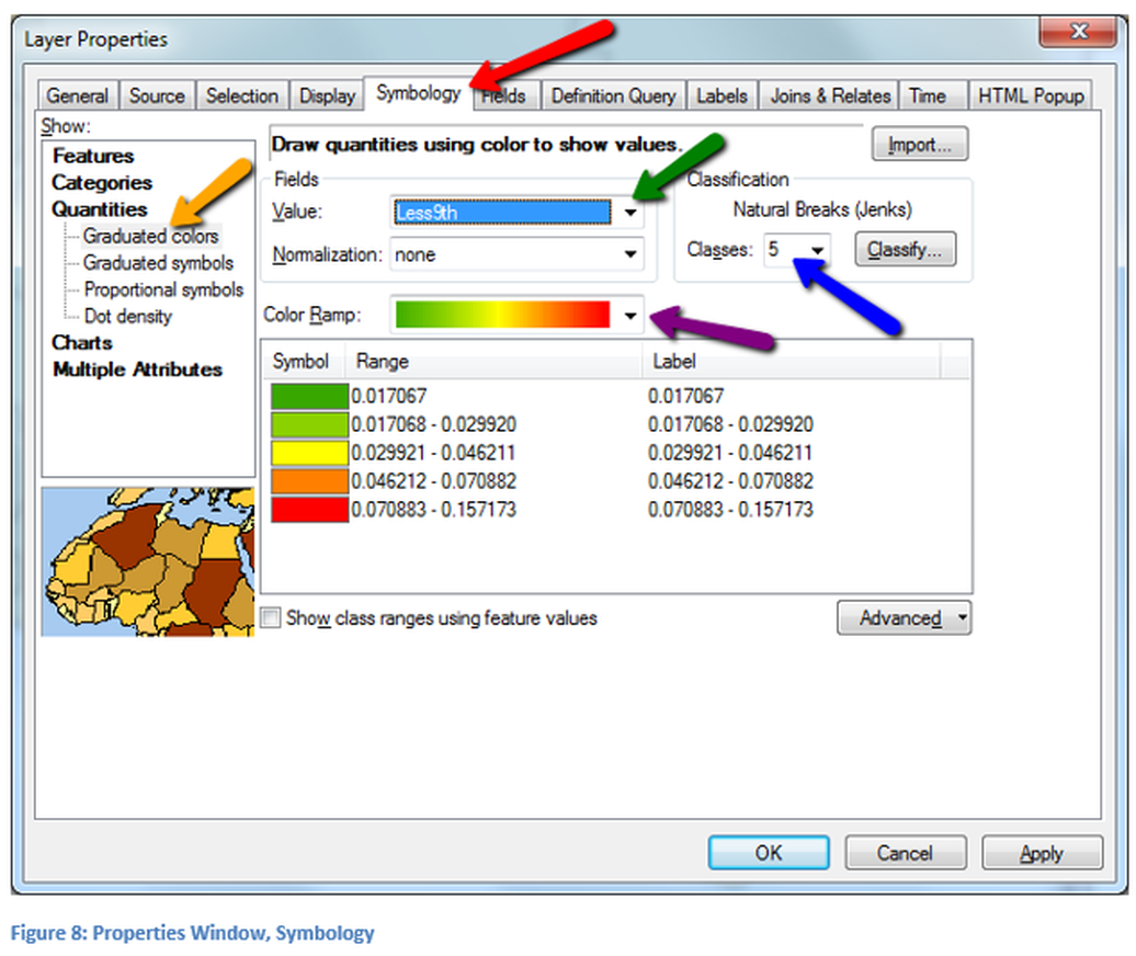
Open the Layer Properties Window for the Census Tract file containing the newly calculated field and select the Symbology tab. In figure 8, the results of this selection are shown. Select the type of classification, select Quantities and graduated colors, which is pointed to by the orange arrow. Use the pull down in the Fields section, for the value which will be displayed, select the newly created field, as shown with the green arrow. Next a ramp color must be selected, which is left to the designer to select. Remember in ramp color selection be aware of ADA considerations and colors that make good presentation of the data. Next select the number of natural breaks, it is suggested that between 4 and 6 breaks are used. For counties with a higher number of census tracts more break points may be used to highlight a specific region. In addition the designer may wish to change the break points and instead of using those selected by the software. Changing the breakpoints can be done to highlight specific areas or to round numbers. When the classification has been completed select ok. A more in-depth study of Symbology is covered in a separate technical skill lesson.
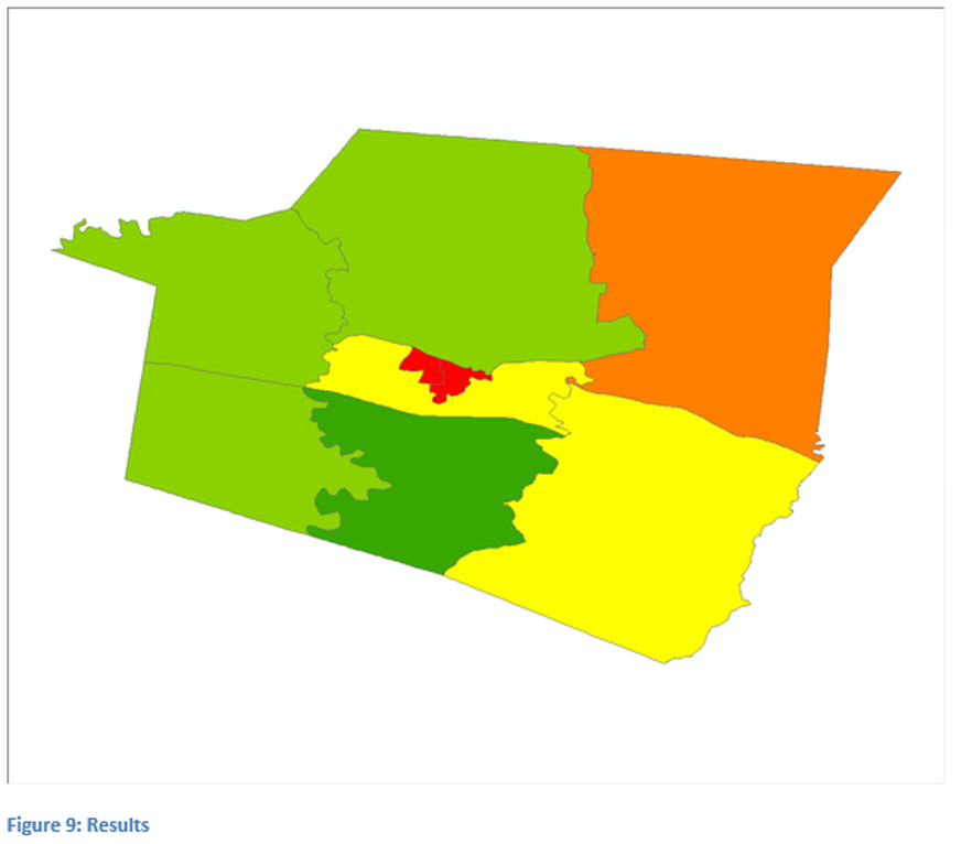
Results of Calculating Data
In Figure 9, those areas that appear with a dark rose color have a smaller ratio of people with less than a 9th grade education, while those areas that appear medium azul color have a higher ratio. The higher the ratio the less educational attainment for the population thus the more people per the total population of the census tract with less than a 9th grade education. The table of contents is not visible in this image. To complete the task the designer could have modified the calculated field by multiplying the result by 100, or use the label button on the Symbology properties window as seen in figure 8.
For analysis a comparison of median income with educational attainment will be produced through by using a query statement. The next part of this technical discussion will concentrate on creation of a proper query of the data source. The shapefile that is being used should be composed of the new calculated column, as well as the median income data.
For analysis a comparison of median income with educational attainment will be produced through by using a query statement. The next part of this technical discussion will concentrate on creation of a proper query of the data source. The shapefile that is being used should be composed of the new calculated column, as well as the median income data.
A more in-depth study of query is located as a separate technical skills lesson.
Query
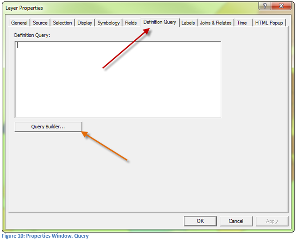
Open the Layer Properties Window for the census tract layer that has the new calculated field and median income data. Select the Query tab and then the Query Builder button. It is suggested that the Query Builder be used instead of writing direct code.
Query Builder
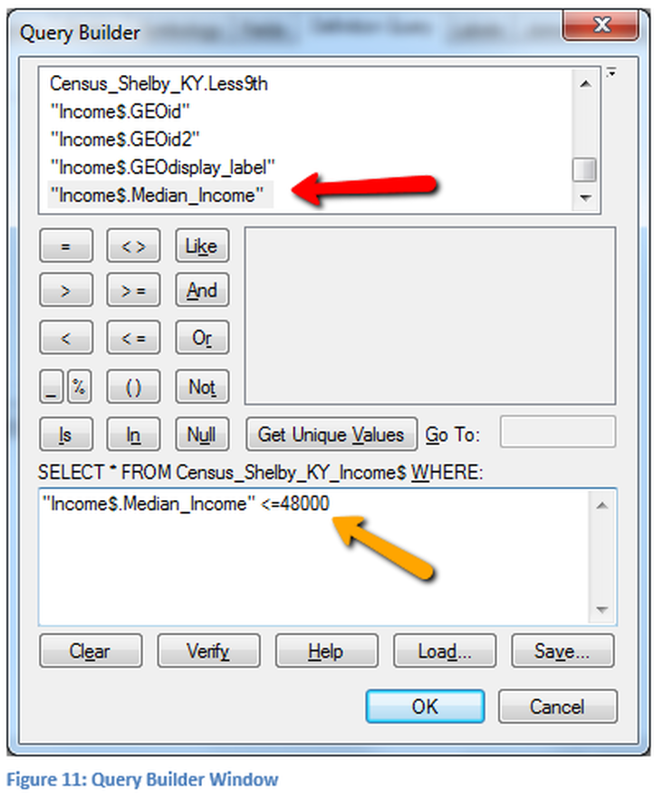
On the map the displayed layer will be the less than 9th grade education. The query will be based on median income. Therefore, those polygons that meet the query logic will be displayed, but the fill will be based upon the educational criteria. The query that will be written is for those families with a median income of less than or equal to $48,000. This expression, in figure 11, is pointed out by the orange arrow. The expression was created by locating the appropriate fields for income in the top window, pointed out by the red arrow. To select a field double click on the name, then use the mathematical operation buttons to execute the desired operation. Finally the keyboard was used to input the 48000. Click OK in this window and also click OK on the Properties Window to execute the query.
What is displayed as a result of the query is the educational ratio of census tracts which have median incomes of $48,000 or less. Therefore by visual inspection an observation can be made determining if educational attainment has an influence on median income. In figure 12 the results of the author’s data are illustrated.
What is displayed as a result of the query is the educational ratio of census tracts which have median incomes of $48,000 or less. Therefore by visual inspection an observation can be made determining if educational attainment has an influence on median income. In figure 12 the results of the author’s data are illustrated.
Results of Query
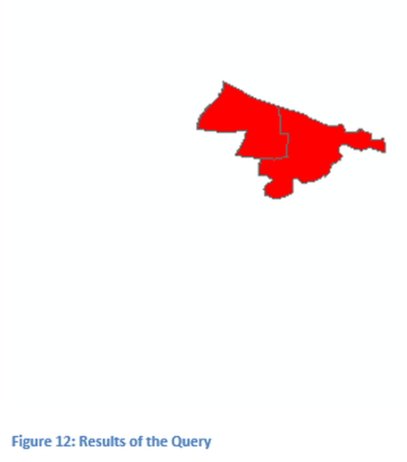
The results of the query are displayed in figure 12, those census tracts that are visible have a median income of $48,000 or less. Note that most of the dark rose colored tracts (small ratios of people with less than a 9th grade education) are no longer visible. Those tracts that are shown with a blue shade are those tracts that have a large ratio of people with less than a 9th grade education.
From this analysis there appears to be a relationship between income and education, but this may only be a single factor. More research would need to be completed to fully understand what is occurring and why. Another map that the designer might construct is a reverse map of higher education attainment and higher income to see if the reverse relationship is also true. That map would be constructed in much the same way as this one by creating a new field that is calculated from other fields of the original data set.
One of the problems with the map displayed in Figure 12 is the lack of a frame of reference. To make this map more representative, a county boundary map might be used. Another addition would be a census tract map with a hollow fill placed as a layer above this map so that those tracts not included would be visible. To create a map for publication consult the technical skills lesson on publishing.

