Poster Creation
In the geospatial field, creation of large posters is a norm. The creation of the poster could be produced using a word processor but the operation is simpler if publishing software is utilized such as Microsoft Publisher. Common poster sizes can measure 30 by 36 inches up to 48 by 96 inches. Good poster creation, much like good presentations and documents, must tell a story clearly. The poster much like a document should be a standalone item. It is always a balancing act to put enough information on the poster to convey the message, while not putting so much information that it becomes cluttered and requires 30 minutes to view the document.
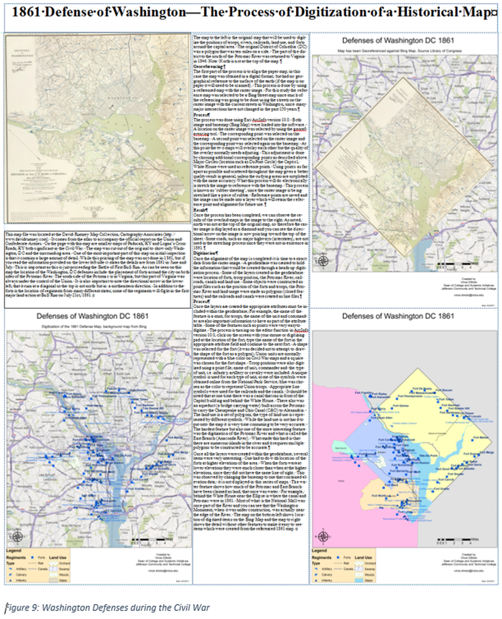
For this lesson, our example will be the creation of a poster for a historical analysis of an area of Louisville, KY located north and south of Broadway between Brook and Second Streets using 1906 Sanborn maps 3 . This area was selected because one of the campuses of Jefferson Community and Technical College is in that location.
1. Before the creation of the poster a clear purpose must be established. It is recommended that all images, including maps, are placed in an appropriate storage area for the project. Creating a draft text in a word processor to explain the poster is recommended. It is likely that as the poster creation moves into the design and layout stages additional information will be required and text will be modified.
2. It is important to understand how close the audience will be to the poster, since this will dictate the size of objects and fonts. If the observer can be close enough to touch the poster then a much smaller font size can be used compared to an audience that will be several feet away. It is recommended that the font size be larger than the traditional 10 to 12 point size, this will ensure that the text is clear and easily read.
3. Make sure that company formatting and policies on poster creation are followed, such as the placement of logos, information blocks, font faces, colors, etc.
|
4. Once the information has been gathered the next step is to set the page size (it is assumed that these will be static posters). This is a critical first step, because if the paper size is changed after the layout has begun, it will be a time consuming process to reformat the information. For this example the poster was 34 inches wide and 72 inches in length. The poster was printed on paper that was 36 inches in width. The information in this poster goes to the edge of the paper since it was known that the paper would be two inches wider than the poster.
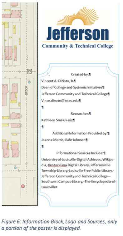
5. Select a title for the poster. For our example the title is: 1906 Sanborn Maps of Louisville, Kentucky: Jefferson Community and Technical College Downtown Campus . While this is a long title it is very descriptive, which is critical since the poster is a standalone report even if a written summary is available to accompany the poster. 6. Placement of a textbox, information about the poster design, should include logo(s). These are generally placed in a predefined location, according to company policies. The designer may actually start with a template that contains predefined elements. Similar to a textbox block on a map, this component was located in the lower right corner. It contains information about the creator and other researchers as well as contact information. This particular textbox also shows the sources of information, see Figure 6 |
|
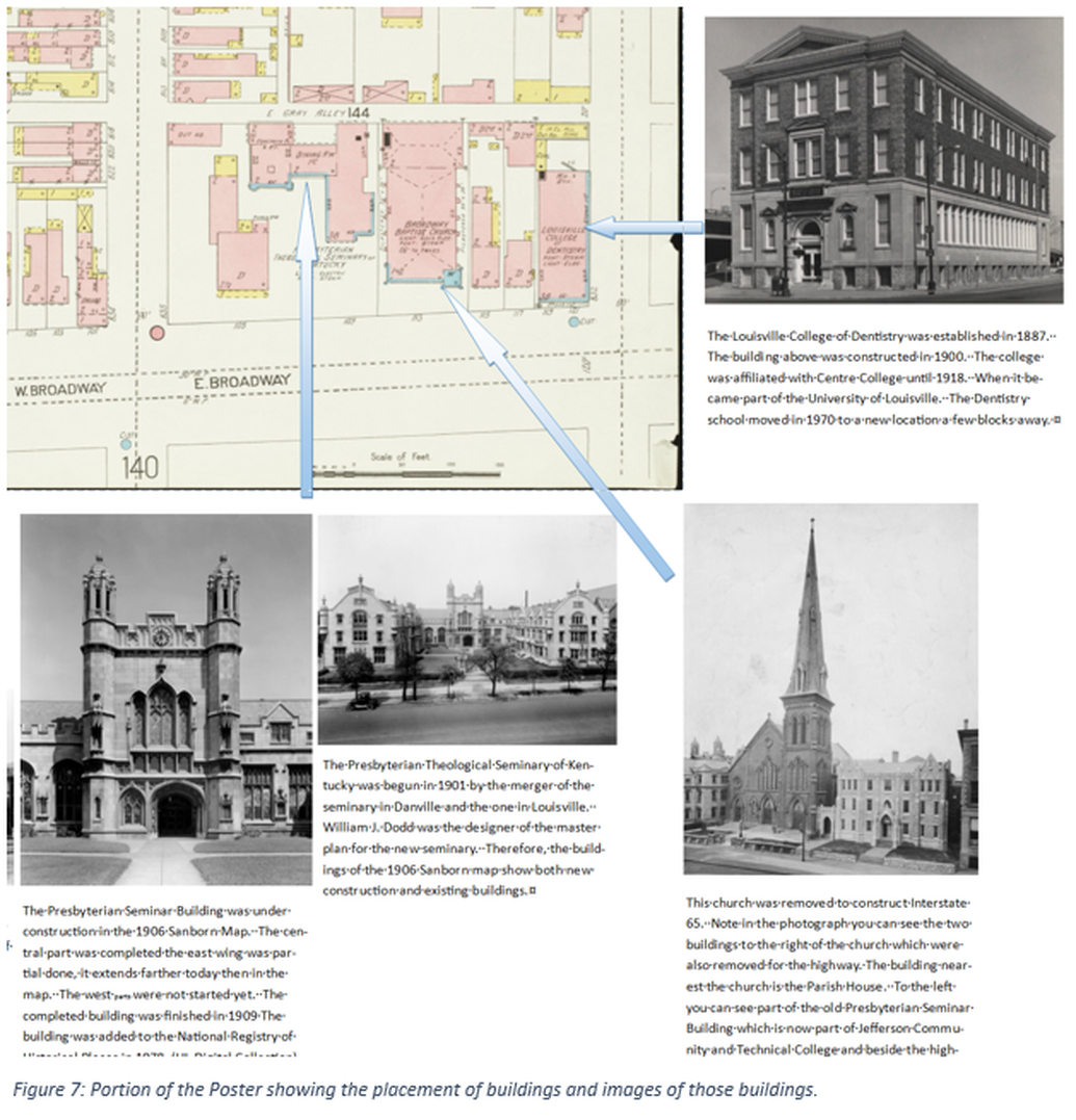
7. Publishing software, requires that textboxes be used for all text. For this particular study, the purpose was to examine the area of the Downtown Campus of JCTC more than 100 years ago. The Sanborn maps were to be the central item in the discussion, images were collected from numerous sources. Textboxes were placed with each image explaining the feature and arrows were drawn from the image to the location on one of the maps.
8. Reference source information that was not created by the designer must the provided. This includes members within the company involved in the project, if they are not the designer/presenter.
9. Once the poster is completed, it is important to decide if the map will be used once or multiple times. This will affect the quality of paper used in creation of the hard copy.
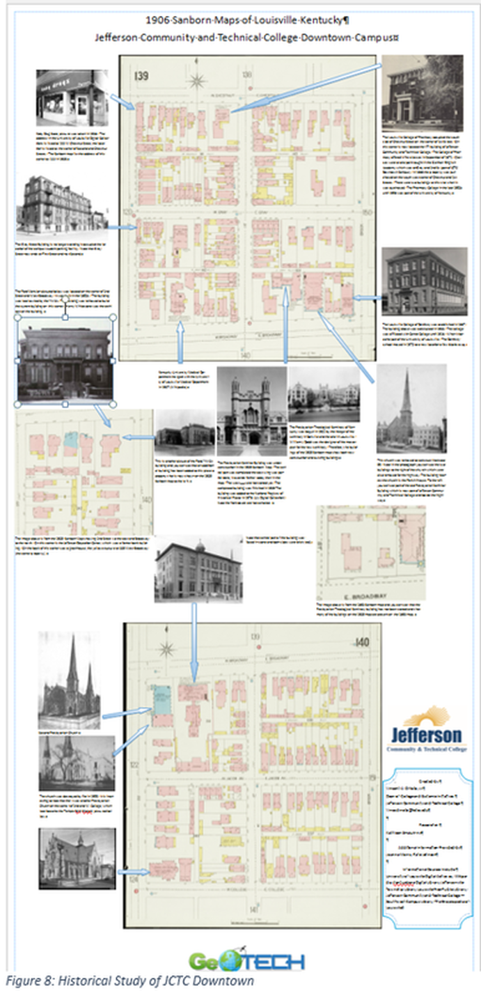
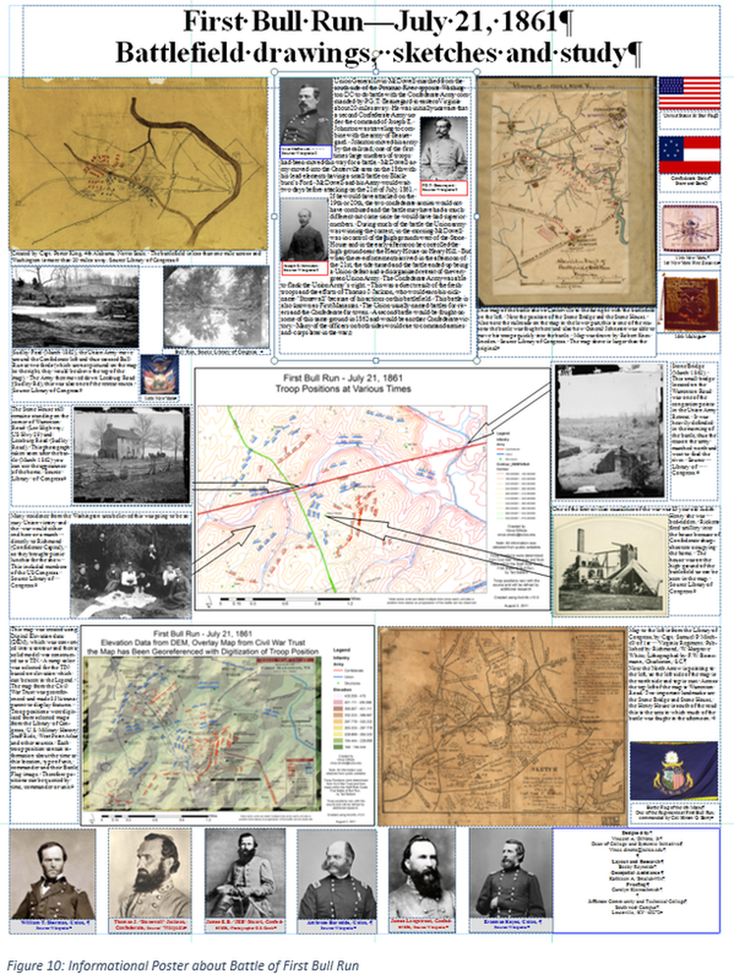
In addition the map should be created as an Adobe Acrobat image so that it can be used by other members of the community and potentially displayed online. The entire poster is shown in Figure 8. Realize the paper size was 36” x 72” for this poster thus the text is not legible. Additional posters are included in figure 9 and 10, to show different layouts. Due to the purpose of some items, not all components listed above are included.