Process
Simple symbol modification
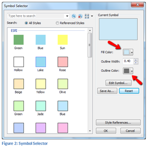
In the table of content double click on the square showing the fill color on the state map. From this window the fill color as well as the line type around the polygon can be modified. The fill color can be a color, hollow or a pattern. A hollow fill is not the same as a white fill, white is opaque. The line width, pattern and color can also be modified. More complicated controls of the symbolism will be performed using the symbology tab in the Symbol Selector window. These basic controls of the symbology can also be completed in the Layer Properties window.
The top arrow in Figure 2 points to the altering of the fill color which can be selected to the left or by using the pull down. The lower arrow is pointing to the selector for the boundary line color.
The top arrow in Figure 2 points to the altering of the fill color which can be selected to the left or by using the pull down. The lower arrow is pointing to the selector for the boundary line color.
In
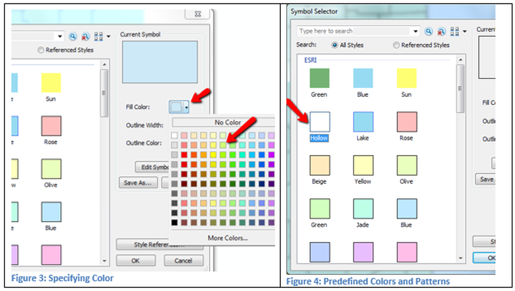
Figure 3, the pull down arrow was selected and multiple colors are available. The
More Colors button give the user all possible color ranges. In Figure 4, the predefined color of hollow
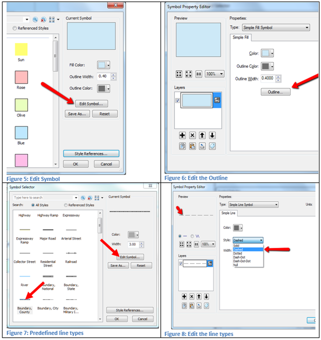
is selected by double clicking it. In Figure 5, the Edit Symbol was selected
which will open a new Symbol Property Editor window. In Figure 6, when Outline is selected the
user can choose predefined outlines or can generate one of their own. Those are shown in Figures 7 & 8.
Similar methods can be done for lines and points. The same methodology can be accomplished by using the Symbology tab.
Single Symbol
Open the Layer Properties window and select the Symbology tab, the results should appear similar to those in Figure 9.
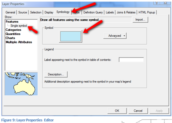
The basic symbolism that was changed by clicking on the color box can also be accomplished in the Symbology tab. The fill color and other properties can be changed by clicking on the large color rectangle. The symbol selector window is the same as used with the small colored square in the table of contents and has all the same properties.
On the left side of the Symbology tab, in Figure 9, note that Features with a Single Symbol has been selected. This refers to the fact that no classification of the data has been completed.
On the left side of the Symbology tab, in Figure 9, note that Features with a Single Symbol has been selected. This refers to the fact that no classification of the data has been completed.
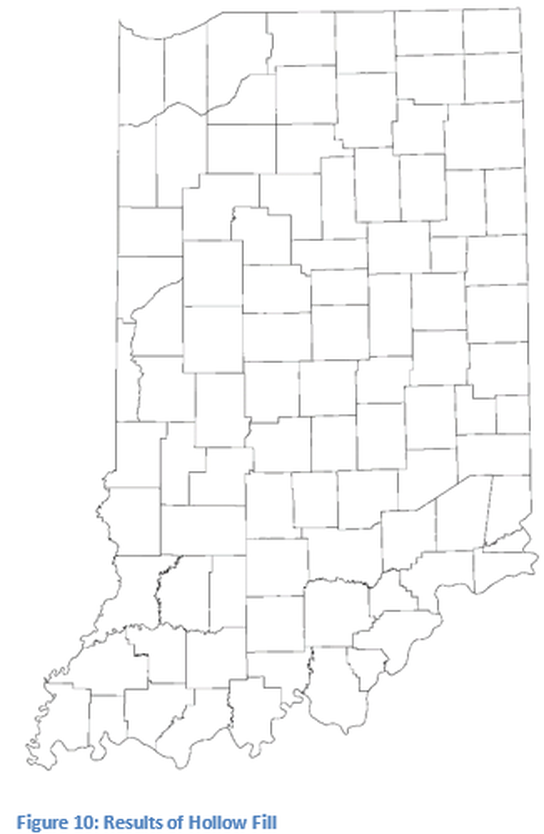
Make sure the State map has a hollow fill, set the outline to the predefined county boundary, see Figure 10. The boundary change is not visible at this resolution. In general one or more layers will have their symbology classified based on the tabular information of the data to be used for analysis.
Categories
One of the ways in which data can be classified is based on values. For example all state highways might be made black at a 2 point width, interstate highways might be yellow using a divided highway symbol, while city streets are grey and .8 points wide. Classifying roads which contain a code for type of highway would be arranged in categories. For example, an interstate line segment might have a code of 1. Using this method all segments with the code of 1 would be displayed with a symbol for interstates. A similar method would be used for U.S Highways, state roads and city streets.
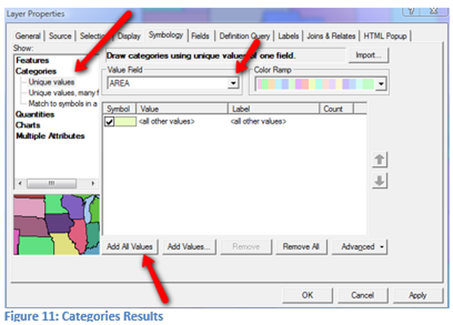
On the symbology tab select the Categories and Unique Values as seen in Figure 11. Next use the pull down in the value field and select a field which will have unique values, in this example the name field will be selected. Then click on Add All Values, so that all the unique values are displayed. The colors to be displayed can be changed individually by selecting each box or as a whole by changing the ramp color.
On the symbology tab select the Categories and Unique Values as seen in Figure 11. Next use the pull down in the value field and select a field which will have unique values, in this example the name field will be selected. Then click on Add All Values, so that all the unique values are displayed. The colors to be displayed can be changed individually by selecting each box or as a whole by changing the ramp color.
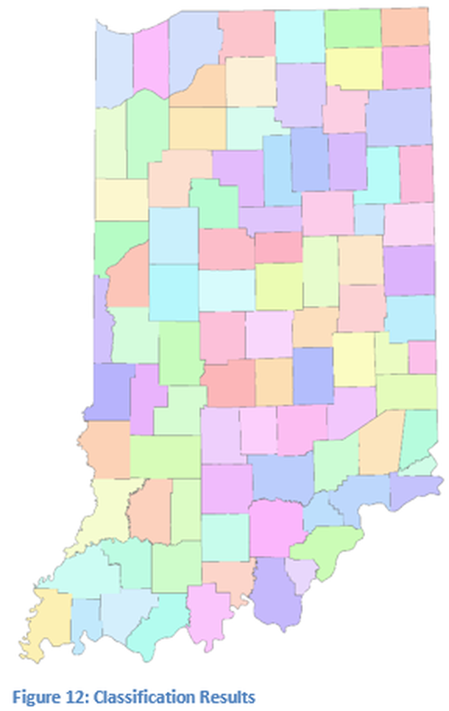
In Figure 12, each county has a unique color based on the color ramp. A different color ramp can be used, but in general do not use a color ramp that has a graduated because it will not have distinct colors and each county should have a unique color. This function can be used with points, lines and polygons.
Quanities
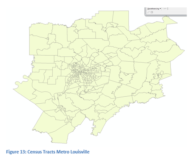
For the quantities part of the technical skills a different shapefile will be used, which has attributes that vary by numerical values so that a classification by range of values can be explored. A range classification is when a numerical range like 0 – 10 would be one color, 11 – 30 a different color, and 31 and above a third color. For example if the census tracts are for the entire state and population of each tract is to be broken into one of five distint colors, a quantities classification would be utilized. Quantity classification can only be used with numeric values. The shapefile used in this excerise is in compressed format located at http://techcenter.jefferson.kctcs.edu/gis/data/Country/USA/State/State.html. Decompress the tract 2000 file and then load into ArcGIS Desktop, the previous map can be removed. The resulting shapefile should appear similar to figure 13.
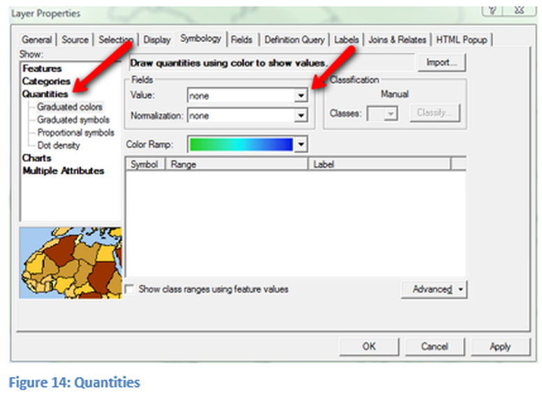
Open the Symbology tab of the Properties Window and select Quantities and Graduated colors on the left menu as seen in Figure 14, (left arrow). The pull down is used to select field value for the classification, for this case P001001, which is a population field in this data file.
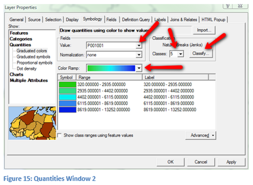
After selection of the field the symbology window should change and look similar to figure 15. Additional properties will be edited before leaving the Symbology tab and viewing the effects on the map. The four red arrows points to components that can be changed to display the information differently. The top left arrow pointing to Values, which contains potentially other numeric fields which can be display. To learn more about census data go to: https://sites.google.com/site/geospatialmaps/resources/census-tracts-for-demographics. The lower left arrow point points to the color ramp which can be changed, graduated colors can be selected, be careful that each color is distinct and that good color usage standards are followed. Do not include red and green on the same map since this does not meet standards for people who are color blind. The number of classes is currently set at five and can be changed by using the pull down arrow. In addition, how the information is displayed can be modified in the Classify button. The classification can be changed manually by changing the end number in the table. By changing the end number, the first number in the next row will change appropriately. The numbers in the table do not have simple break points, the first line end of range number is 2935, the designer might change that to 2950 or 3000. Breaks do not need to be even and many times are selected to show emphasis on specific details. The number of decimal points can be changed by clicking on the label button. The label button can be used to control how data is displayed in the legend. There are additional properties that can be controlled in the symbology window and they should be explored.
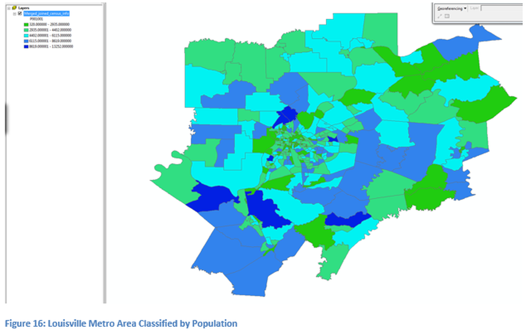
In Figure 16 the final results of the classification process are displayed. Note the legend has many fractional decimal points which is not appropriate because this is population data and fractional people cannot exist, this is not an average of people but actual head count. The legend should show no decimal points.

